BASIC-LIBRARY / SECTION / COLLECTIONS
Collections Seven
Visual Showcase
Explore curated visual experiences that reflect the intersection of innovation, culture, and design. Each frame tells a story worth seeing.
@import url("/template/basic-library/section/collections/collections-seven/raw/styles.css");
<div
class="bg-white pt-6 pb-6 py-6 sm:pt-8 sm:pb-8 sm:py-8 lg:pt-12 lg:pb-12 lg:py-12"
>
<div
class="ml-auto mr-auto mx-auto max-w-screen-2xl pl-4 pr-4 px-4 md:pl-8 md:pr-8 md:px-8"
>
<div class="mb-10 md:mb-16">
<h2
class="mb-4 text-center text-2xl font-bold text-gray-800 md:mb-6 lg:text-3xl"
>
Visual Showcase
</h2>
<p
class="ml-auto mr-auto mx-auto max-w-screen-md text-center text-gray-500 md:text-lg"
>
Explore curated visual experiences that reflect the intersection of
innovation, culture, and design. Each frame tells a story worth seeing.
</p>
</div>
<div class="grid grid-cols-2 sm:grid-cols-3 gap-4 md:gap-6 xl:gap-8">
<a
href="#"
class="group relative overflow-hidden flex h-48 items-end justify-end rounded-lg bg-gray-100 shadow-lg md:h-96"
>
<img
src="https://images.unsplash.com/photo-1593508512255-86ab42a8e620?auto=format&q=75&fit=crop&w=600"
loading="lazy"
alt="Photo by Minh Pham"
class="transition duration-200 group-hover:scale-110 absolute inset-0 h-full w-full object-cover object-center"
/>
<div
class="pointer-events-none bg-gradient-to-t from-gray-800 via-transparent to-transparent absolute inset-0 opacity-50"
></div>
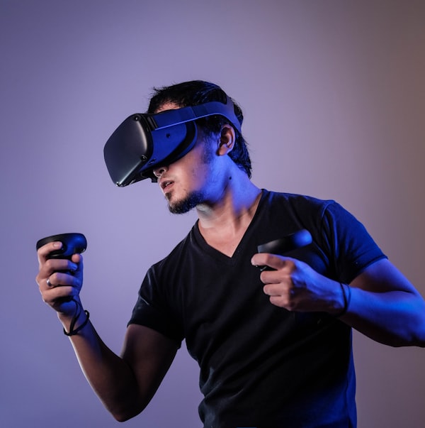
<span
class="relative inline-block backdrop-blur mr-3 mb-3 rounded-lg border border-gray-500 pl-2 pr-2 px-2 pt-1 pb-1 py-1 text-xs text-gray-200 md:pl-3 md:pr-3 md:px-3 md:text-sm"
>
Immersive
</span>
</a>
<a
href="#"
class="group relative overflow-hidden flex h-48 items-end justify-end rounded-lg bg-gray-100 shadow-lg md:h-96"
>
<img
src="https://images.unsplash.com/photo-1550745165-9bc0b252726f?auto=format&q=75&fit=crop&w=600"
loading="lazy"
alt="Photo by Lorenzo Herrera"
class="transition duration-200 group-hover:scale-110 absolute inset-0 h-full w-full object-cover object-center"
/>
<div
class="pointer-events-none bg-gradient-to-t from-gray-800 via-transparent to-transparent absolute inset-0 opacity-50"
></div>
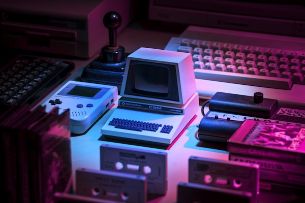
<span
class="relative inline-block backdrop-blur mr-3 mb-3 rounded-lg border border-gray-500 pl-2 pr-2 px-2 pt-1 pb-1 py-1 text-xs text-gray-200 md:pl-3 md:pr-3 md:px-3 md:text-sm"
>
Analog
</span>
</a>
<a
href="#"
class="group relative overflow-hidden flex h-48 items-end justify-end rounded-lg bg-gray-100 shadow-lg md:h-96"
>
<img
src="https://images.unsplash.com/photo-1542759564-7ccbb6ac450a?auto=format&q=75&fit=crop&w=600"
loading="lazy"
alt="Photo by Magicle"
class="transition duration-200 group-hover:scale-110 absolute inset-0 h-full w-full object-cover object-center"
/>
<div
class="pointer-events-none bg-gradient-to-t from-gray-800 via-transparent to-transparent absolute inset-0 opacity-50"
></div>
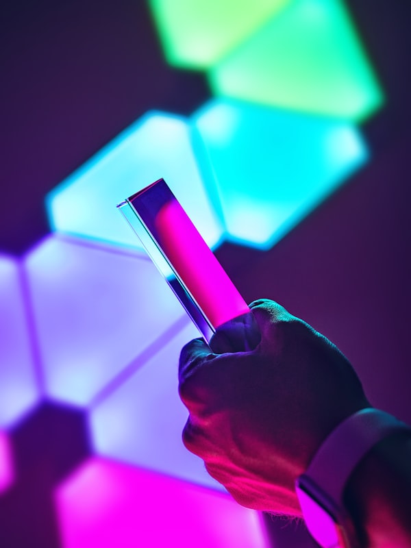
<span
class="relative inline-block backdrop-blur mr-3 mb-3 rounded-lg border border-gray-500 pl-2 pr-2 px-2 pt-1 pb-1 py-1 text-xs text-gray-200 md:pl-3 md:pr-3 md:px-3 md:text-sm"
>
Innovation
</span>
</a>
</div>
</div>
</div>
© 2025 tailsections.com. All rights reserved